The different types of Responsive Design
- 27th August 2013
- Tutorials
- 9:35 reading time (ish)
- 1823 words
In this post I will be discussing Responsive Web Design and Fixed Responsive Web Design along with Client-Side Adaptive Design and Server-Side Adaptive Design. This post is aimed towards anyone seeking understanding on each technique available and how each method varies.
Looking for a quick and simple definition of RWD/AWD?
- A responsive web design can fluidly change to fit any browser/screen size using a combination of percentage or fixed dimensions and media queries.
- An adaptive web design changes to suit its environment using but not limited to media queries which target device types. Client-side specialises in media queries and JavaScript where Server-side will often load a separate design for smaller screens compared to a desktop version.
Intro
It’s quite funny really, in our industry we have all agreed what flat design is, how alt tags should be used and what Meta tags to use. So why is it that it’s now been over three years since Responsive Design first came around and still the term ‘Responsive Design’ and ‘Adaptive Design’ is still yet to be firmly defined? Oh and what the heck is FRWD? Well keep reading!
Responsive Web Design
Ethan Marcote, web designer and author, is widely cited as coining the term Responsive Design which is the use of media queries to serve different CSS styles. By doing so designers are able to change a website’s appearance when viewed on different screen sizes (or browser window sizes).
The key advantage of this Responsive Design approach is that designers can use a single website design to target all devices and determine how content is displayed by using a language they’re already comfortable with, such as HTML and CSS. Of course there are many designers who choose to use HTML5 and CSS3, although this is not a requirement.
Even designers who aren’t confident with languages and media queries can take advantage of free open-source resources focused on responsiveness such as Foundation to create some effective responsive web sites.
So what’s the disadvantage then? Well unfortunately what many designers who use RWD are unknowingly neglecting, is the purpose. You’re creating a responsive design not only for desktop, but for a range of other, smaller devices with smaller screen sizes. These devices are often on a limited data plan when roaming which tend to load websites fairly slow, in comparison to a desktop connected to WiFi.
I’ve taken a few hours to look around on some well-established websites today and what I’ve found is unfortunate. Out of 50 responsive websites, the average page size was 1.3 MB. If you consider your audience is loading your website on a 3G connection for example, this is going to take time to load and use up an unnecessary amount of data allowance.
The majority of the time this extra page size is of course unavoidable, when you load a responsive website on a mobile device you’re loading all the resources required at every step of the design. You’re essentially loading 3-4x more CSS alone. Now imagine if you had a web site design that has a lot of content, content of which requires its own set of CSS rules. The amount the user is going to have to download will increase substantially.
It’s not all doom and gloom for Responsive Design though. Correctly planned out and developed with optimisation in mind the results can greatly improve the user’s experience.
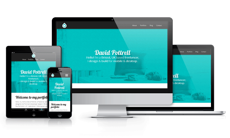
My own website, David Pottrell.co.uk, for example is a mere 543.3 KB. Of course, my own website has very little content to load in comparison to some websites that averaged over double this file size. It’s for this reason that Responsive Design is best suited for websites with a consistent design that can take advantage of sharing CSS rules.
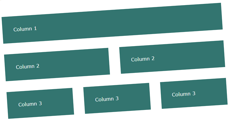
Example of Responsive Web Design with Percentages
Looking at this technique closer, what’s known as RWD today is essentially the next stage of fluid design. The main issue with the fluid design technique is that at a certain point, the content begins to ‘break’. You can only resize the layout so far before the content starts to look ugly. This is where RWD comes in.
So taking a fluid web design that uses percentages, we can now add media queries to create RWD. Take a look at the fluid design example, now have a look at the RWD example, same layout, similar code. The only difference is the RWD takes advantage of media queries.
The main reason I believe some designers and developers shy away from RWD comes down to how time consuming it can be. Remember that RWD is still a fairly new concept, so websites that have been live for years now are comfortable.
Many designers in the industry will hopefully agree with me here when I say. It’s more time efficient and in turn financially efficient to develop a responsive web site from scratch, rather than converting an already establish web site structure into a RWD. It’s for this reason that a lot of web sites live today will wait until the they want a complete site overhaul to convert to responsive design (unless RWD is simply not needed).
Fixed Responsive Web Design
A lot of designers and developers, especially when starting out, shy away from percentages. So what if you’re still uneasy with percentages or don’t have the development time personally or financially? You could try Fixed Responsive Design; although I’m sure certain designers/developers may have a different name for it. I tend to refer to the technique by this name. It’s definitely not new and a lot of other industry resources already use it or a very similar technique such as Bootstrap.
The key advantage for this technique is that it can be applied to already established web sites. It still would take time to implement but can be a lot easier than if you were to attempt to convert to RWD. Another advantage would be that when it comes to FRWD, you have complete control over how all the web page elements look at every stage of resizing unlike RWD where at certain stages, certain elements may not look the way you want them. If that’s the case you have to either change the element layout or change the media query stepping point.
At the time of writing, I can only think of two disadvantages for FRWD. The main disadvantage is shared with RWD and is mentioned earlier in this post. When loading a website using FRWD, all the resources are still loaded, potentially slowing the website down on mobile connections.
The other disadvantage which is slightly more cosmetic based, is that where RWD steps down and scales fluidly, Fixed Responsive Web Design is more rigid and snaps while it steps down. Some users may like this as it’s obvious what the website is doing, others may prefer a fluid approach.
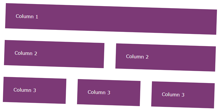
Example of Responsive Web Design with Pixel (FRWD)
This method bridges the gap between a fixed layout and a responsive layout. It’s the technique of having several fixed width designs and stepping them down with media queries, similar to RWD.
Unfortunately the definitions of what makes an RWD and an AWD are still unclear. This could technically be classed as an Adaptive Design, the overall layout is adapting to different device sizes after all – however it’s also responding to your browser window size.
Either way, here’s an example of Fixed Responsive Web Design (FRWD)
Client-side Adaptive Web Design
Adaptive design builds on the technique of responsive design to produce a user experience truly adapted to the user’s needs. Client-side adaptive design often takes advantage of JavaScript and/or media queries to contribute additional functionality and customisation to a website. A lot of Client-side adaptive websites combine media queries with this JavaScript functionality to create a truly dynamic user experience that works great.
The key advantage for Client-side AWD is the fact that, because you’re targeting certain criteria’s, the user isn’t downloading multiple versions of the same stylesheet or loading unnecessary resources. They are only downloading what they need to display the website. This of course has the potential to speed up the website and keep page load times to a minimum.
Another example of this is the capability of offering Retina-quality images to only Retina displays. Devices that are unable to take advantage of Retina quality would download the normal image. This process in turn saves bandwidth and if the visiting user is on a mobile connection, saves data allowance.
So what’s the disadvantage of AWD? Simply put, the language. In order to create an AWD that’s effective you need to have a solid understanding of JavaScript which tends to be fairly difficult in comparison to HTML and CSS. This of course only applies if you do not want to rely on media queries.
Either way, using plug-ins such as RetinaJS (providing you don’t mind console ‘Missing Image’ errors) can make life easier and will allow you to target Retina-images for Retina capable screens. If you’re not against media queries (not sure why you would be), have a read of Chris Coyier’s Retina Display Media Query tutorial which is still relevant today.
Server-side Adaptive Web Design
This technique isn’t for the faint hearted, done correctly though the advantages can be very beneficial. Server-side adaptive design uses server-side plugins and/or user agent detection. One popular website that uses this technique is Etsy.com, a handmade online marketplace. I definitely recommend checking out their website on desktop and then on mobile to see the difference.
So why choose this technique? What are the advantages? Well for one thing you definitely get a lot more customisation options. Using this technique you have complete control over what mobile users see on your website. Instead of using the CSS declaration display:none, you can provide a different layout completely for your content. In my opinion you should always avoid display:none. Assume your readers, mobile or desktop, want to see all your content.
Not only do you have complete control over your design on each device, the pages should ‘technically’ load faster because they’re only loading the resources needed, keeping in mind that a lot of common caching mechanisms would need to be disabled to avoid performance issues for smaller devices.
As I mentioned before however, this approach is certainly not for the faint hearted. This technique requires a lot of work behind the scenes and can be quite costly to implement. Not to mention a higher level of technical knowledge.
Now you have to consider that, when it’s time to change design, each version of the website is essentially its own website. If you cater to desktop, tablet and mobile. That’s three different websites.
I’ve done an AMA about Responsive and Adaptive Design on Reddit on the 28/08/2013 at 8AM EST (1PM GMT+1), I plan to add any of the popular questions asked to this post with the answer(s), stay tuned!